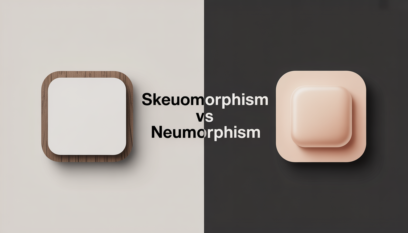
In digital design, UI/UX fields often talk about skeuomorphism vs neumorphism. These two trends have shaped how we interact with digital interfaces. Skeuomorphism uses real-world textures in digital design for an easy-to-use experience.
Neumorphism came later, keeping the focus on depth and detail but with a simpler look. It brings a fresh feel to UI/UX, blending new and old in a subtle way. The debate between skeuomorphism and neumorphism shows how design affects our experience with digital tools.
What is Skeuomorphism?
Skeuomorphism is a design philosophy that uses familiar physical cues to improve digital interfaces. It adds elements that remind us of real-world objects, textures, and functions. This makes technology easier for more people to use, connecting old experiences with new interactive designs.
The power of skeuomorphism comes from its ability to guide users through digital spaces. It uses recognizable cues to help users navigate better. Adding shadows, gradients, and textures makes digital spaces more engaging and easy to use.
In short, skeuomorphism is key in interactive design. It helps users get used to new tech without feeling overwhelmed. It makes digital and physical worlds meet, making interfaces more comfortable and effective.
The Rise of Neumorphism
The design philosophy of neumorphism combines the feel of skeuomorphism with the simplicity of modern UI. It started to become popular around 2019-2020. This blend keeps the comfort of skeuomorphism but adds a modern touch.
Unlike skeuomorphism, neumorphism uses soft colors. This makes UI elements blend better with their surroundings. It reduces the harsh contrasts seen in older designs.
Neumorphism finds a middle ground between old and new. It uses a subtle style to suggest depth and enhance user interaction. Features like soft shadows and light give a 3D feel without being too busy.
This design aims for a clear, uncluttered digital space. It shows how elements can feel like part of the background. This creates a more natural user experience.
Even though it looks great, neumorphism is slow to catch on in digital design. It faces issues like low contrast for those with vision problems. Also, it can make buttons and interactive parts hard to spot.
Still, for designers looking to create something new and unique, neumorphism is an interesting choice. It offers a fresh way to design within modern UI standards.
Comparing Aesthetics: Skeuomorphism vs Neumorphism
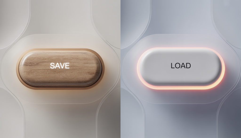
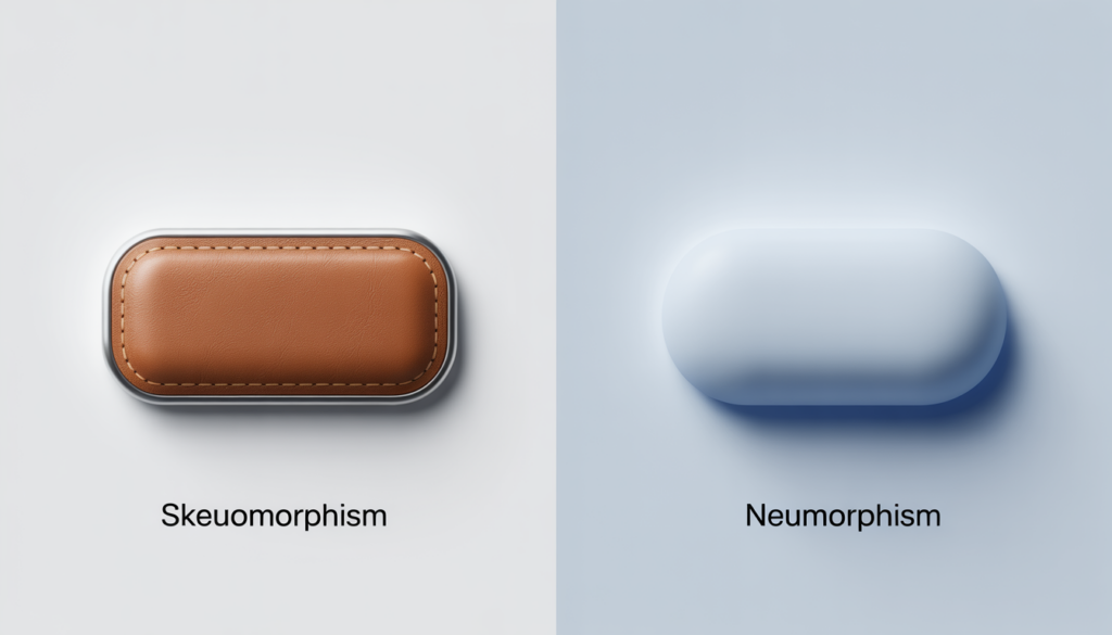
The debate between skeuomorphism and neumorphism focuses on their visual philosophies. Skeuomorphism uses detailed textures and 3D effects to mimic real materials. This makes digital spaces feel rich and familiar, enhancing user experience.
Neumorphism, on the other hand, simplifies designs into soft, semi-flat shapes. It uses muted colors and clear elements for a minimalist look. This style keeps things simple and easy to use, without being too bold.
Both styles are important in design, guiding how users interact with products. Skeuomorphism relies on familiarity, while neumorphism looks to the future with its minimalist approach. Designers need to understand these differences to create products that are both intuitive and visually appealing.
User Experience: Skeuomorphism’s Appeal
Skeuomorphisms in UI/UX design have a special charm. They make digital things feel familiar and nostalgic. For example, a digital notebook that looks like a real one is not just pretty. It also makes using it easier and more enjoyable.
These designs also create a strong emotional bond with users. It’s not just about feeling comfortable with what you know. It’s about feeling connected and engaged with what you’re using.
Even with new design trends, skeuomorphism is still valuable. It connects the digital world to the real one. This makes users feel more confident and comfortable in new digital spaces. It shows why skeuomorphism is still important in today’s digital world.
User Experience: Neumorphism’s Fresh Approach
Neumorphism is changing digital design, moving towards minimalism in UI/UX. It uses a simple color scheme and soft shadows to make things easier to use. This style makes digital spaces look modern and clean.
Neumorphism shows how things work by changing light and shadow, not just color. This makes it stand out in digital design.
Even though it’s subtle, neumorphism makes digital design more engaging and easy to use. Designers must find a balance between looks and function. This is a challenge that tests their skills and creativity.
By using neumorphism, designers make digital spaces more friendly and clean. They push the limits of what digital interfaces can be.
When to Use Skeuomorphism
Skeuomorphism is great in many digital places, like when we want to show familiar objects. It’s super useful in interactive design for apps that need to be easy to use. For example, digital music tools that look like real instruments help musicians get used to them fast.
This makes the user experience better, blending old ways with new tech smoothly.
In schools and fun places, skeuomorphic designs really help people get involved. They make things look and feel like the real thing, which helps us learn and have fun. For example, an app that looks like a real history book makes learning about history more fun.
Also, tools we use every day, like digital calendars that look like paper planners, show how skeuomorphism makes tech easier. It uses designs we already know, making new tech feel more welcoming. This makes sure that using digital products is easy and comfortable.
When to Opt for Neumorphism
Neumorphism is great for creating a modern and simple look in UI design. It works well when you want to add a touch of depth and softness. This design is perfect for apps that need a clean and elegant interface.
For example, music players or advanced control panels benefit from neumorphism. It keeps the design simple yet visually appealing. This makes the interface easy to use and looks sleek.
Neumorphism uses soft colors and shadows to make elements seem to float. This not only makes the design look good but also helps users understand what they can click on. It’s a trend that combines beauty with function, making it ideal for creating modern and user-friendly digital spaces.
Challenges in Both Design Approaches
UI/UX designers face many challenges when choosing between skeuomorphism and neumorphism. Skeuomorphism’s detailed look can make interfaces look good but feel cluttered. Designers must focus on keeping things simple to avoid overwhelming users.
Also, skeuomorphism might slow down websites on slower devices. This is because of all the extra details.
Neumorphism, on the other hand, is all about simplicity and modern looks. But, its soft feel can make things hard to see, which is bad for users with vision problems. Making neomorphic designs that everyone can use takes a lot of work on color and shadow contrasts.
Both skeuomorphism and neumorphism need a lot of creativity and technical skills. They require finding the right balance between how things look and how they work.
Future Trends in UI Design
Looking ahead, UI/UX design will change a lot. Users want things to look good and work well. Designers are mixing skeuomorphism and neumorphism to meet this need. This mix offers a design that’s both beautiful and easy to use.
Designers want to make interfaces that everyone can enjoy. They aim to use familiar patterns but also keep things simple. This approach makes things more accessible and engaging, which is key for UI/UX’s future.
The future of UI/UX design will blend looks and function perfectly. By learning from skeuomorphism and neumorphism, designers will create designs that fit everyone’s needs. This will lead to new, exciting ways to interact with technology.


