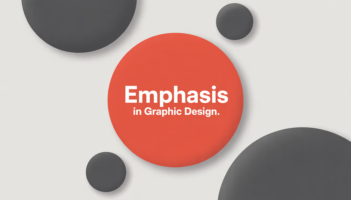
When we talk about emphasis in graphic design, we’re exploring how to draw your audience’s eye to the most important part of your message. It’s about creating a focal point in your design that grabs attention quickly. But how do you achieve this instant reaction?
The answer is through a range of graphic design techniques that spark curiosity and encourage action. These techniques are key to effective visual communication techniques. They help guide viewers to take action, whether it’s clicking a link or picking up the phone.
Using the right elements like lines, colors, and textures can make a big difference. It’s all about balance and using white space wisely. These strategies can turn a simple design into a powerful piece of digital art.
In a world filled with visual information, mastering emphasis is crucial. It helps you stand out and make your mark in the fast-changing world of marketing and design.
Understanding Emphasis in Graphic Design
The role of visual design in graphic design is huge. Emphasis is key to making sure viewers see what’s most important. It helps focus attention on the main points of a design.
Good emphasis grabs and keeps the viewer’s eye. This makes the message clear and quick to understand.
Visual hierarchy is central to graphic design impact. Designers use a step-like arrangement to lead the viewer’s eye. This makes the content easier to follow and understand.
This approach keeps important messages clear. It helps avoid getting lost in less important details.
Emphasis in graphic design does more than look good. It shapes how we see and act on information in business and ads. A smart emphasis strategy boosts communication in digital, print, and infographics.
This shows the big impact of graphic design on how we make choices.
The Role of Hierarchy in Emphasis
In graphic design, understanding visual hierarchy in design is key. It helps create visuals that grab attention and share a message clearly. By organizing design elements, you can change how people see and understand information. This is crucial for focusing on the most important parts of your design.
Good graphic design principles use size, scale, and color to create a clear hierarchy. Big elements get noticed first, making them perfect for showing off key info. This follows visual communication techniques, guiding the viewer’s eyes to important spots.
Color is also essential in this hierarchy. It adds beauty and affects how people feel. Using contrasting colors or unexpected color changes can lead the viewer’s eyes to the main message. This makes sure your design not only looks good but also communicates well, making visual hierarchy in design a must for professional work.
Techniques to Create Emphasis
In graphic design, making things stand out is key. Designers use many techniques to guide the viewer’s eye and highlight important messages. One way is through contrast—using different colors, shapes, or sizes to grab attention.
For example, a bright color on a dull background can make a button pop. This makes it clear where to click or look.
Another important tool is white space, or empty space. It helps organize the design and make certain parts stand out. This empty space gives a break in the layout, making the filled areas more noticeable.
Designers also play with alignment and textures to catch the eye. Changing the usual layout or adding a bold texture can keep viewers interested. These strategies make designs not just pretty but also effective at sharing messages or feelings.
Using these design principles creatively helps designs grab and keep the viewer’s attention. Mastering these techniques is crucial for designers who want to make a lasting impact with their work.
Color Choices and Their Impact
Color theory is key in graphic design, shaping how we feel and what we notice. Warm colors like reds and oranges energize us. Cool colors, such as blues and greens, calm us down. This shows how colors deeply affect us.
Using the right colors can grab our attention and make a design stand out. This leads to better interaction with the audience. Colors can even change how we feel, making content more impactful.
Choosing colors well is not just about picking pretty ones. It’s about understanding how colors work together. Colors opposite each other on the color wheel create stunning contrasts. This makes designs bold and engaging.
But the real power of color goes beyond looks. It’s about creating feelings and connections through design. This makes our messages more than just pretty pictures; they become powerful tools for communication.
Typography: An Underappreciated Element of Emphasis
In graphic design, typography is very important. It shapes how we see and understand content. Good typography draws our attention to important parts of the design.
Designers use font sizes, styles, and arrangements to guide our eyes. This makes it easy to see what’s most important without feeling overwhelmed.

Typography’s details, like weight and spacing, are key to a design’s success. Using bold or italic fonts can make important details pop. Enough space between elements helps them stand out.
Choosing the right fonts can add interest and keep us engaged. This is crucial for clear and effective communication.
Typography is more than picking pretty fonts. It’s about creating structure, emphasis, and interest in our designs. It’s essential for designers to master these principles.
The Use of Images in Creating Emphasis
Using carefully chosen images is key in graphic design techniques to focus attention. Designers place images to break the usual flow. This highlights important messages and captures the viewer’s eye.
Visual communication uses images to stir emotions and share complex ideas quickly. For example, a big image on a layout grabs attention and emphasizes the main theme. Choosing and placing images wisely makes a design stand out and keep the viewer interested.
Knowing how images impact emphasis helps designers create more engaging designs. They use contrasts and align elements to guide the eye. These choices are vital for a design’s success. Using these techniques makes designs more appealing and effective.
Emphasis in Branding
Graphic design plays a huge role in branding. A strong visual identity is key in today’s marketing world. It helps a brand stand out and succeed.
Branding’s success depends on how visual elements are used. For example, graphic design uses strategic contrasts and alignments to grab attention. This makes a brand easy to remember and unique.
Color, typography, and imagery shape a brand’s visual identity. These elements are carefully chosen to connect with the audience. They show a brand’s values and personality in a subtle yet powerful way.
A strong visual identity uses these elements well. It makes sure every marketing message shows what the brand is about. This consistency builds a loyal customer base and influences buying choices. It shows the branding impact at every touchpoint.
Emphasis in Web Design
In the digital world, using good web design strategies is key to leaving a mark. The focus in web design is on making the user experience better and easy to navigate. Designers use various elements to draw attention to important parts like menus, buttons, and key info.
Also, web design emphasis goes beyond just looks. It’s about making sure the site works well on all devices. With so many devices out there, having a site that adjusts to each one is crucial. This means the site looks and works great on phones, tablets, and computers.
By combining these strategies, websites become not just pretty but also useful. This leads to a better user experience, which encourages people to stay and interact. The right focus can greatly improve how people use and enjoy a website.
Common Mistakes to Avoid
Graphic design often faces common pitfalls that can mess up a project. A big one is a lack of visual clarity, which can confuse the message. Designers need to find a balance to avoid too much or too little emphasis.
Too much emphasis can make visuals chaotic, while too little can make the main message hard to see. This balance is key to clear communication.
Another big challenge is cluttered layouts. When too many things fight for attention, the main message gets lost. Spotting these mistakes early can save time and improve the design’s impact.
Fixing these errors leads to clearer, more effective designs. This makes communication through design much better.
In short, keeping visuals clear is crucial for designers. It ensures messages are strong and reach the audience well. By avoiding these mistakes, designers can create designs that clearly get their point across.
Real-World Examples of Successful Emphasis
Looking at real-world graphic design examples shows us how emphasis makes visual communication work. The “Think Different” campaign by Apple is a prime example. It used simple designs and black-and-white photos of famous people. This grabbed people’s attention and showed Apple’s focus on innovation and creativity.
The London Underground’s poster series is another great example. It used bright colors and simple shapes. These made navigating the subway easy and became symbols of reliability. This shows how clear and focused design can make something both memorable and useful.
These examples are more than just inspiration. They teach us about using visual hierarchy and emphasis in design. By studying these examples, new designers can make their work more impactful and lasting.
Final Thoughts on Emphasis in Graphic Design
Effective emphasis is key in graphic design, not just a nice touch. It deeply impacts how viewers see our designs. Color, typography, and images all play a role in making our message stand out.
Creating emphasis is a mix of creativity and careful planning. It lets designers make unique and memorable designs. This balance keeps graphic design fresh and exciting.
Learning to use emphasis well takes time and practice. It’s important to know what to avoid and when to break the rules. Our goal is to make designs that grab and hold attention, telling stories that stay with us.


