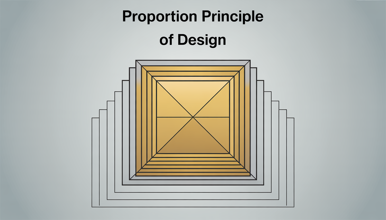
In the world of design, the proportion principle of design is key. It brings together all the parts of a design in a balanced way. This balance is what makes a design look good and feel right.
It’s seen in big buildings and on websites. The right proportions guide our eyes and tell a story without words. This is how proportions create a visual order.
Proportion is at the core of design theory. It’s about how sizes work together to make things clear and impactful. The Golden Ratio is a classic example of this principle.
This principle has stood the test of time, adapting to changing cultures. It helps us create spaces and images that are pleasing to the eye. Let’s use the proportion principle to find harmony in our designs.
Understanding the Proportion Principle of Design
The proportion principle of design shapes how objects fit in a space. It makes the visual experience harmonious. Designers use this principle to create layouts that draw the eye and build meaningful spatial relationships.
This principle ensures each part of a design works well with others. It feels right to our eyes. It’s key to making designs that work well together.
Mastering the proportion principle is crucial for visual balance. It’s used in graphic design, architecture, and digital media. Proper use of proportion makes environments look and function better.
It’s about making elements the right size for their importance. This guides the viewer’s attention where it should be. Proper size and placement are key to a design’s success.
Using the proportion principle is more than symmetry. It’s about creating spaces and images that feel right. These spaces are beautiful and work well.
These principles help arrange furniture and website layouts. They make spaces easy to navigate and pleasing to look at. They guide the physical and visual paths in our environment.
Knowing and using these principles makes visuals more dynamic and engaging. The proportion principle is not just about looks. It’s a key part of effective design strategy.
Historical Context of Proportion in Art and Design
The ancient design principles have greatly influenced modern aesthetics. The golden ratio in design shows the lasting impact of proportion. This mathematical concept has brought harmony and balance to art and architecture for centuries.
The Greeks were known for their use of symmetry and proportion. They used the golden ratio in buildings like the Parthenon. Their work set a standard that still guides design and architecture today, showing the importance of design guidelines in creating visual harmony.
In the Renaissance, there was a renewed focus on symmetry, with the golden ratio at its core. Artists and architects of that time aimed to include this proportion in their work. This created a visual appeal that speaks to our sense of order and beauty.
This journey through history shows the deep impact of the golden ratio in design. It also reveals the enduring principles of balance in human creativity.
The Role of Proportion in Different Design Disciplines
In the world of design, proportion is key. It brings balance and harmony to all sorts of designs. This is true for graphic, interior, and fashion design. Knowing how to use design elements well is crucial for making things look good and work well.
In graphic design, proportion helps arrange text, images, and space. Designers use grids or flexible layouts to guide the viewer’s eye. This makes the design look good and easy to understand.
In interior design, proportion is just as important. It makes sure spaces look good and are useful. Furniture, decorations, and even building parts are sized right for each other and the room. This creates a sense of togetherness and comfort.
Fashion design also relies on proportion. Designers think about how clothes fit and look on the body. Getting the proportions right can make a big difference in how a design looks and feels.
So, proportion is a big deal in design. It helps designers make things that are balanced, harmonious, and well-thought-out. By getting good at this, designers can make their work more functional and beautiful.
Key Mathematical Ratios in Design Proportion
In design, precision and beauty often rely on math. The golden ratio is a key concept, found in many famous artworks and buildings. It’s about 1:1.618 and helps create balance and harmony.
The Fibonacci sequence also plays a big role in design. It’s a series of numbers where each is the sum of the two before it. This pattern inspires many designs, showing up in nature and the human body.
Designers use these ratios to add timeless beauty to their work. The golden ratio and Fibonacci sequence can turn simple designs into stunning pieces. They help connect math with beauty, opening up new ways to arrange and design.
How to Apply Proportion in Visual Composition
Proportion is key in visual composition for visual harmony and balance and harmony in design. Designers use it to make their work more engaging and pleasing to the eye. It helps distribute visual weight, creating balance and guiding the viewer’s eye.
Designers use proportion to create focal points that grab attention. They play with scales and contrast to highlight certain parts of the design. This makes the composition more appealing and ensures it feels complete, keeping balance and harmony in design.
By carefully using proportion, designers can tell a story with their visuals. They can share messages more clearly and effectively.
Common Mistakes When Using Proportion
One big design mistake in interior design is not scaling elements right. This can make rooms feel too small or too big. It’s key to know how furniture, rugs, and lights fit with the room’s size.
For example, a big family room needs a bigger rug. A 9×12 rug is better than a 5×8. It looks and feels better.
Lighting is another area where mistakes happen. Designers or homeowners often pick lights that don’t fit the room or furniture. A dining room chandelier should be half as wide as the table.
Ignoring how people see the design can also be a problem. A design might look good to the creator but not to others. This is very important in places where people interact a lot.
By making sure elements fit well together, designers can avoid mistakes. This makes spaces that are fun and welcoming.
Tools and Techniques for Measuring Proportion
In the world of design, like graphic, architectural, or interior, getting proportions right is key. The right design tools and interior design measurement techniques are crucial. Graphic designers use grids and guidelines to place elements evenly and keep things balanced.
Interior designers use special design tools for precise space planning. Scale rulers help turn real measurements into smaller, easier-to-manage scales. Digital modeling software lets designers play with space and furniture virtually, making sure every detail fits the design guidelines.
These design tools make spaces both functional and beautiful by following design guidelines and interior design measurement standards. Using these tools at every design stage ensures the final product looks great and works well. It shows how important exact proportions are in creating top-notch designs.
Cultural Variations in Design Proportion
Design proportion changes a lot across cultures. It’s shaped by each region’s unique style. Looking at different cultures, we see big differences between Eastern and Western design.
In Eastern art, asymmetry is key. It shows the beauty of not being perfect. This reflects values of naturalism and spontaneity. On the other hand, Western design likes symmetry and balance. It uses the Golden Ratio to show order and perfection.
Designing for a global world is complex. Knowing about Eastern and Western design helps a lot. It’s not just about understanding different styles. It’s crucial for designers working worldwide.
Designers who respect these differences can work better globally. They create designs that are rich and inclusive. These designs show the beauty of different cultures coming together.
How Technology Affects Proportion in Design
The move from old design ways to new digital methods has changed how designers think about proportion. Today, designers use special software to control design elements better. This software lets them tweak dimensions quickly, blending old design rules with new tech.
Digital tools connect the old with the new, keeping design’s core while making it more efficient. They help designers tackle complex designs that were hard to do by hand. This tech boost helps in both creativity and precision, pushing design forward.
Even with tech’s big role, design’s main goals stay the same: to create visual harmony and balance. Designers use both old ways and new software to achieve this. So, tech doesn’t replace old methods but makes them better and more flexible.
Case Studies of Successful Proportional Design
In design, architectural proportion is key for both looks and use. The Parthenon in Athens is a prime example. It shows the power of proportion in creating beauty and balance.
Today, buildings around the world still follow these classic proportions. They mix old and new styles to look great and work well.
Proper proportion is just as important in graphic design campaigns. Good proportions in ads help get the message across and grab attention. They use images and words in a way that connects with people and makes them feel something.
Studies of successful designs show how crucial proportion is. They highlight its beauty and usefulness. They also give new designers a chance to learn and grow.
These design case studies show how important proportion is in design. They show its beauty and usefulness. They also give new designers a chance to learn and grow.
The Future of Proportion in Design
Looking ahead, the future of design is changing fast. Sustainable design is playing a big role in how we think about proportion. With the world facing big environmental challenges, designers are now focusing on making things better for our planet.
They’re looking at old ways of designing and making them better. This means using less resources and making less waste. It’s all about making designs that are good for the environment.
New design trends are blending beauty with being green. This change is making us rethink how we measure things in design. Now, proportion is not just about looking good. It’s also about being kind to our planet.
This change is more than just about looks. It’s a big shift in how we see design. Designers are now making things that are not only beautiful but also good for the Earth. This shows that design can be both beautiful and responsible.
Mastering the Proportion Principle
Starting your journey in mastering design principles, like exploring design proportion, gives you the tools to create stunning and balanced works. We’ve seen how proportion has been key throughout history and in today’s designs. It’s what makes designs look good and work well, making things easy to use and telling strong stories.
Understanding the math and culture behind proportion lets designers share messages in a clear and engaging way. This connects with people on a deep level.
At the heart of becoming good at design is learning about proportion and how it can make something special. Designers use proportion to communicate visually. This skill is not just a goal but a journey that requires trying new things and staying open to change.
As technology and culture change, proportion remains a key tool for creating exciting and moving designs.
If you’re in design, whether you’re new or experienced, there’s always more to learn about proportion. Using these basic principles can greatly change how people see and value your work. Dive into mastering design principles and let proportion guide you to create lasting works that touch people and stand the test of time.


