The difference between an app that feels polished and one that feels flat often comes down to details users cannot name but always notice. Micro-interactions are those details: the subtle animation when you like a post, the haptic tap when a toggle switches, the progress ring that keeps you from abandoning a slow upload. This guide explains what micro-interactions are, why they matter, and how to design them well.
What Are Micro-Interactions?
A micro-interaction is a contained product moment that performs a single task. It communicates status, guides a step, prevents errors, or confirms an action. Every digital product contains dozens of them whether the design team planned them or not.
The Four Parts of a Micro-Interaction
Designer Dan Saffer’s framework breaks every micro-interaction into four components. The trigger initiates the interaction through user action or a system event. The rules define what happens after the trigger fires. The feedback is what the user sees, hears, or feels. The loops and modes determine how long it lasts and whether it changes after repeated use.
This four-part structure applies to every interaction. A password strength indicator uses a user trigger (typing), a rule (evaluate character variety), feedback (a color bar), and a loop (updates each keystroke). Understanding this structure helps you design micro-interactions intentionally rather than accidentally.
Micro-Interactions vs. Animations: What Is the Difference?
Not every animation is a micro-interaction. An onboarding illustration that plays once on first launch is an animation. A button that changes color when you press it is a micro-interaction. The distinction is function. Micro-interactions serve a specific communicative purpose tied to user action or system state. Decorative animations serve a visual or brand purpose without communicating anything functional.
Both have a place in product design. The problem comes when designers treat micro-interactions as decoration and use them to add visual flair without a clear functional purpose. That leads to the most common failure: motion that slows users down instead of helping them.
Why Micro-Interactions Matter in UX Design
Small interactions carry significant weight in shaping how users feel about a product. They signal quality, communicate system status, and reduce the uncertainty that makes digital interfaces frustrating.
How They Build Trust Through Feedback
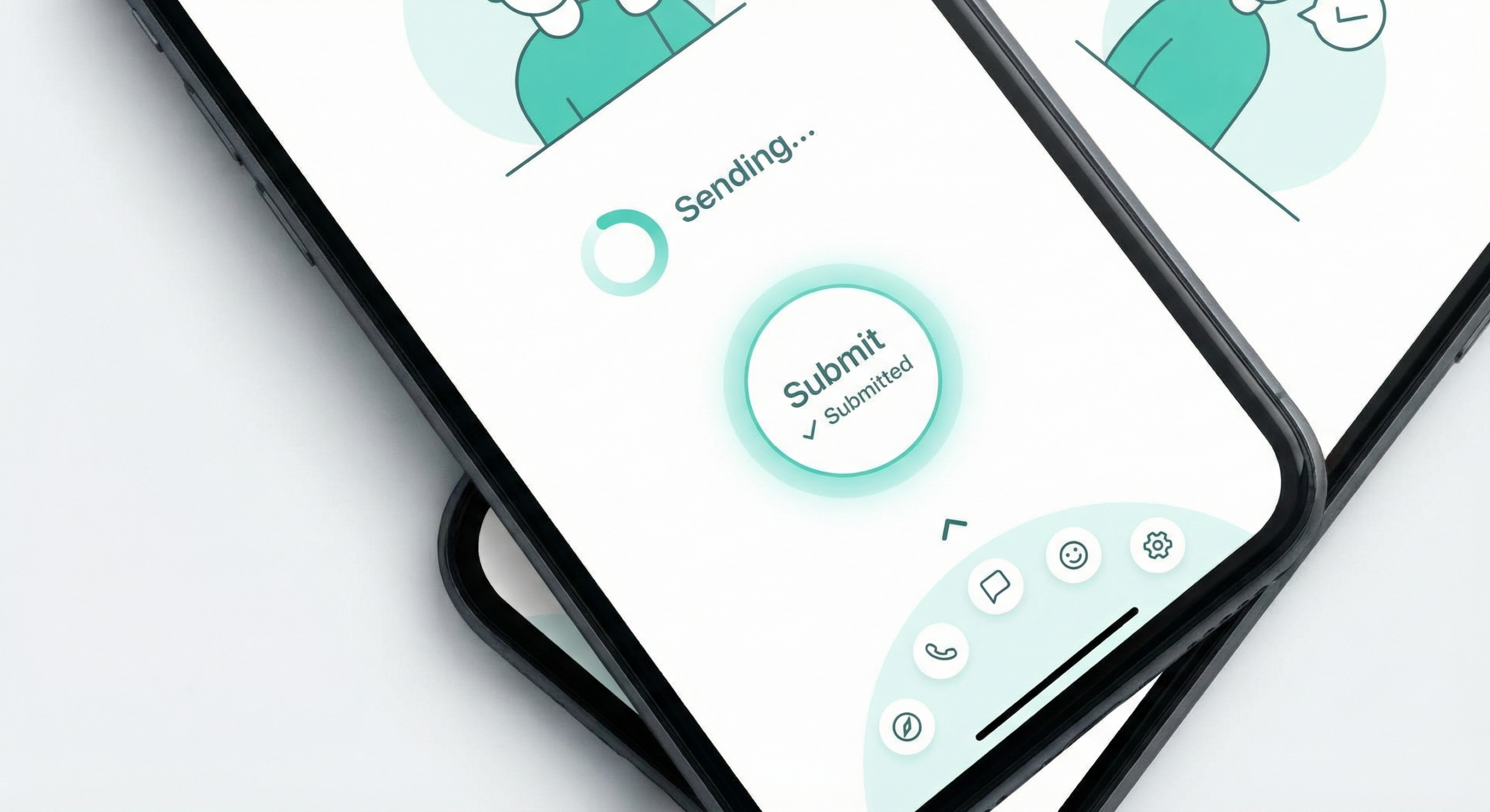
Users need to know their actions worked. When someone taps a submit button and nothing visually changes, they tap it again. They wonder if the app froze. A loading state, a button color change, or a brief success animation tells the user the system received their input. Research on system status visibility confirms users tolerate delays better when they receive clear feedback. A micro-interaction showing progress during a one-second delay reduces perceived wait time and prevents abandonment.
The Emotional Impact of Tiny Details
Micro-interactions shape emotional response at a subconscious level. The satisfying snap of a completed task, the playful bounce of a heart icon on double-tap, the gentle shake of a form field on invalid input: none of these are necessary for the product to function. All of them shape how users feel while using it.
Products with well-designed micro-interactions feel smooth and responsive even when users cannot name the specific details creating that impression. Products without them feel flat or cheap even when the feature set is identical.
The Most Effective Types of Micro-Interactions
These categories appear most frequently and have the most direct impact on user experience quality.
Feedback and Confirmation States
Feedback micro-interactions confirm that the system received a user action. A button that briefly depresses on tap, a form field that turns green after valid input, a checkmark that animates in after a successful save: these confirmation states answer the user’s question “did that work?” before the user has to ask it. On mobile, haptic feedback supplements the visual state change and creates a physical sense of completion.
Progress and Loading Indicators
Progress micro-interactions manage expectations during waits. A progress bar shows how far along a process is. A skeleton screen shows where content will appear before it loads. A spinner signals that work is happening when no percentage is available. Each reduces the anxiety gap between action and result.
Skeleton screens outperform blank loading states in perceived performance. Users rate content as loading faster with a skeleton screen even when actual load time is identical.
Input and Error States
Form micro-interactions guide users through data entry and catch mistakes before submission. Inline validation that confirms a correctly formatted email reduces abandonment. A field that gently shakes on invalid input is more effective than a static error message that appears only after submission fails.
Timing matters: validate on blur (when the user leaves a field), not on every keystroke. Showing an error before the user finishes typing feels accusatory and drives abandonment.
Micro-Interaction Design and Prototyping Tools Compared
Choosing the right tool depends on whether you need to prototype interactions for stakeholder review or ship motion code to production.
| Tool | Type | Best For | Code Output | Learning Curve | Free to Use |
|---|---|---|---|---|---|
| Framer | Design and prototype | High-fidelity interactive prototypes | Yes (React) | Medium | Free tier |
| ProtoPie | Prototype | Complex interaction logic without code | No | Low | Free tier |
| Principle | Prototype (macOS) | Quick timeline-based motion prototypes | No | Low | Trial only |
| Framer Motion | Code library (React) | Production micro-interactions in React | Yes (native) | Medium | Yes (open source) |
| Lottie (Airbnb) | Animation playback | Complex vector animations from After Effects | JSON export | Low | Yes (open source) |
| CSS Transitions | Code (native) | Simple state transitions in any web project | Yes (native) | Low | Yes |
How To Design Effective Micro-Interactions
The best micro-interactions feel invisible. Users notice when they are absent, not when they are present. Designing to that standard requires restraint and intentionality.
Start With User Intent, Not Animation
Before adding motion, identify the specific question the micro-interaction needs to answer. Did my action register? Is something loading? Did I make an error? Every micro-interaction should answer exactly one question clearly and immediately.
If you cannot state the communicative purpose of a motion in one sentence, remove it. Motion that communicates nothing functional adds visual noise and increases cognitive load. Defining purpose first produces better interactions than designing animation for its own sake.
Timing, Easing, and Duration
Duration and easing determine whether a micro-interaction feels smooth or jarring. Most UI micro-interactions should run between 100 and 300 milliseconds. Under 100ms feels instantaneous and misses the communicative window. Over 300ms feels slow and makes the product seem unresponsive.
Easing curves control acceleration through the animation. Ease-out suits elements entering the screen. Ease-in suits elements leaving. Linear easing, the default in many tools, feels mechanical. Replace it deliberately rather than accepting the default.
Common Micro-Interaction Design Mistakes
Most micro-interaction failures come from the same small set of errors.
Over-Animating and Adding Friction
The most common mistake is adding too much motion. Every animation has a duration cost. When users must watch an animation complete before they can act, the interaction blocks their flow. A button that takes 600 milliseconds to finish its press animation before submitting has made the product slower, not better.
If a micro-interaction is not communicating something specific and useful, cut it. Reduce duration on anything that delays user action. Friction points where users tap twice or look confused usually trace back to micro-interactions that are missing or get in the way.
Ignoring the Reduced Motion Preference
Users with vestibular disorders or motion sensitivity can enable the prefers-reduced-motion setting in their OS. Ignoring this setting means your micro-interactions can cause physical discomfort for some users.
Every web micro-interaction should include a prefers-reduced-motion alternative. For most, the alternative is the end state without the transition: the button changes color without animating, the checkmark appears without drawing itself. Functionality stays intact and motion is removed for those who need it.
Design the Details That Users Remember
Users do not read design docs or benchmark your component architecture. They feel whether tapping your app is satisfying or frustrating, responsive or sluggish, thoughtful or careless. Micro-interactions determine that feeling more than almost any other design decision you make.
Keep durations short, easing natural, and purpose singular. Respect the reduced motion preference. Remove anything that slows users down without communicating something useful. The details that survive that filter are the ones users remember without knowing why.
Frequently Asked Questions
What is a micro-interaction in UX design?
A micro-interaction is a contained design moment that performs a single communicative task: confirming an action, showing progress, or signaling an error. They are the small animations, state changes, and feedback signals that make digital products feel responsive and alive rather than static and flat.
What are examples of micro-interactions in apps?
Common examples include the heart animation when you like a post on Instagram, the haptic feedback when a toggle switches on iOS, skeleton screens that appear while content loads, inline form validation turning a field green after valid input, and the pull-to-refresh animation on mobile apps. Each performs a specific communicative function tied to a user action or system state.
How long should micro-interactions last?
Most micro-interactions should last between 100 and 300 milliseconds. Under 100ms feels instantaneous and may not register as feedback. Over 300ms starts to feel slow and can block user action. Interactions tied directly to user input should stay as short as possible while remaining perceptible.
What is the difference between a micro-interaction and an animation?
A micro-interaction serves a functional communicative purpose tied to a specific user action or system event. A decorative animation may serve a brand purpose without communicating anything functional. All micro-interactions involve motion or state change, but not all animations are micro-interactions. The distinguishing factor is whether the motion answers a specific user question.
What tools do designers use for micro-interaction prototyping?
The most widely used tools are Framer and ProtoPie for high-fidelity prototypes, Principle for quick timeline-based motion on macOS, and Framer Motion or CSS transitions for production web implementation. Lottie handles complex vector animations exported from After Effects. The right tool depends on whether you need a prototype for review or production-ready code.
How do micro-interactions affect conversion rates?
Well-designed micro-interactions reduce form abandonment through inline validation feedback and reduce support contacts by clearly communicating system state during errors. They increase repeat engagement by making the product feel satisfying to use. Their impact is cumulative, but removing them consistently degrades experience quality and engagement metrics.
How do you make micro-interactions accessible?
Implement the prefers-reduced-motion CSS media query to serve non-animated alternatives to users who have enabled reduced motion in their OS settings. Never convey information through motion alone. Any status change communicated through animation must also appear as text or a screen reader announcement so users who cannot perceive motion still receive the feedback.