Accessibility is no longer optional. In 2026, over 1.3 billion people worldwide live with some form of disability — and poorly designed products exclude them entirely. Beyond the moral case, accessible design is also smart business: it expands your user base, improves SEO, and increasingly, it’s required by law (ADA, WCAG 2.2, EU Accessibility Act).
But accessibility doesn’t mean making things “special” for people with disabilities. Done right, accessible design makes products better for everyone — clearer navigation, better contrast, more logical structure. This guide covers the principles and practical techniques every designer and product team needs in 2026.
What Is Accessible Design?
Accessible design (also called inclusive design or universal design) is the practice of creating products that can be used by people with a wide range of abilities, including those with visual, auditory, motor, or cognitive disabilities. The gold standard is WCAG 2.2 (Web Content Accessibility Guidelines), which defines accessibility across four principles:
- Perceivable — Information must be presented in ways users can perceive
- Operable — Interface components must be navigable
- Understandable — Content and UI must be understandable
- Robust — Content must work with assistive technologies
The Business Case for Accessibility
Market Size
People with disabilities represent a $490 billion annual spending market in the US alone. Add their friends and family, and the “disability market” influences over $8 trillion in disposable income globally. Products that exclude this group leave serious money on the table.
SEO Benefits
Accessible design and good SEO share many practices: semantic HTML, descriptive alt text, clear heading structure, fast load times. Improving accessibility almost always improves search rankings.
Legal Requirements in 2026
| Regulation | Region | Who It Affects | Standard Required |
|---|---|---|---|
| ADA (Title III) | USA | Public-facing websites | WCAG 2.1 AA |
| EU Accessibility Act | Europe | Private sector products | EN 301 549 |
| AODA | Canada (Ontario) | Organizations 50+ employees | WCAG 2.0 AA |
| BS 8878 | UK | Web products | WCAG 2.1 |
Core Accessible Design Principles in Practice
1. Color Contrast
Text must have a contrast ratio of at least 4.5:1 against its background (WCAG AA). For large text (18pt+), the minimum is 3:1. Tools like the WebAIM Contrast Checker or Figma plugins make this easy to verify during design — not after.
2. Keyboard Navigation
Every interactive element — buttons, links, forms, modals — must be reachable and operable by keyboard alone. This means logical tab order, visible focus states, and no “keyboard traps” where users get stuck in a component.
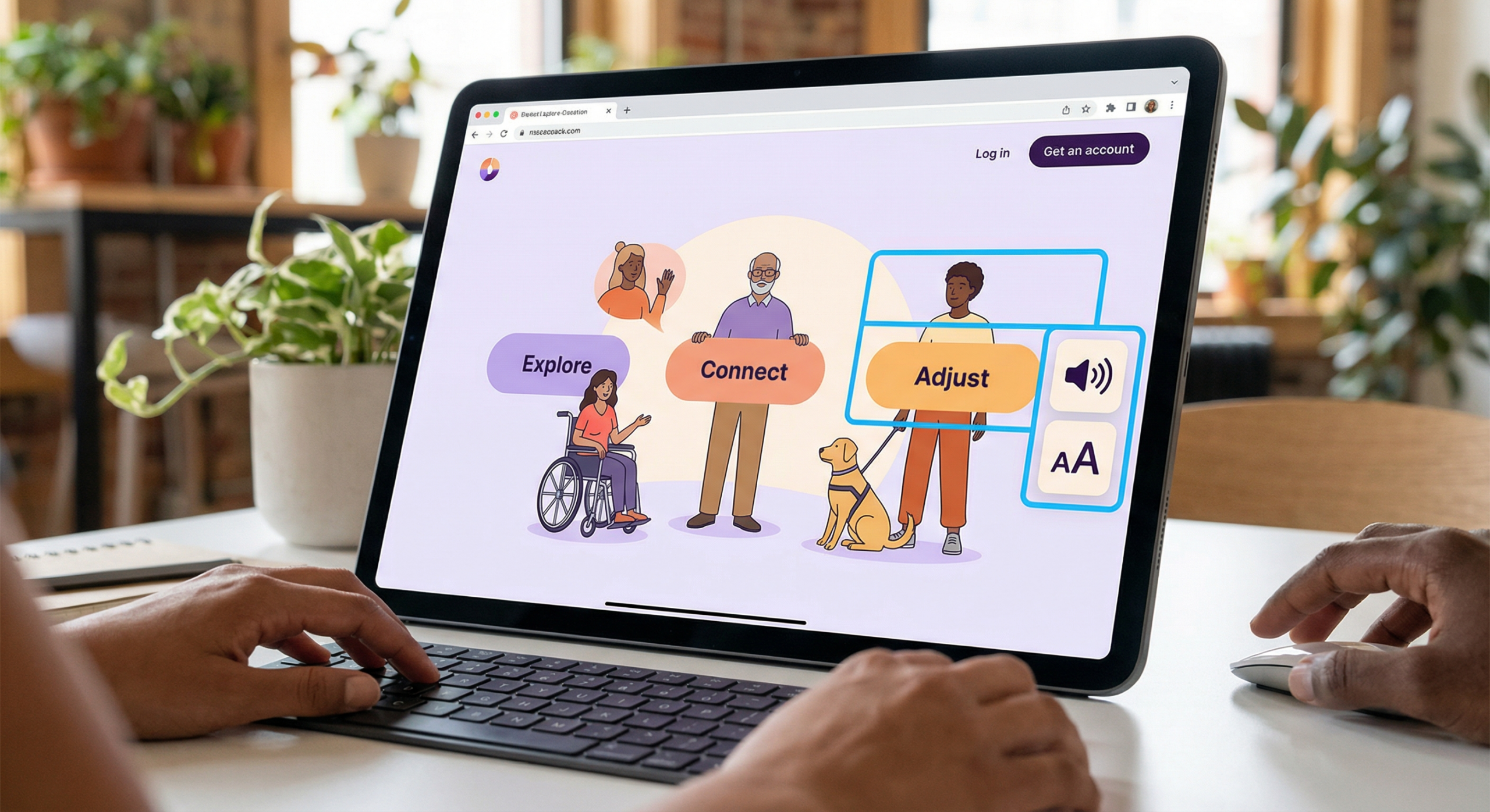
3. Alternative Text for Images
Every meaningful image needs descriptive alt text. Decorative images should have empty alt attributes (alt=””) so screen readers skip them. Write alt text that conveys the purpose of the image, not just what it looks like.
4. Semantic HTML
Use HTML elements for their intended purpose: headings for structure, buttons for actions, links for navigation. Avoid building interactive elements with divs — screen readers rely on semantic markup to interpret page structure.
Practical Accessibility Checklist for 2026
- ✅ Colour contrast meets WCAG 2.2 AA (4.5:1 minimum)
- ✅ All interactive elements reachable by keyboard
- ✅ Focus styles visible and clear
- ✅ All images have descriptive alt text
- ✅ Forms have associated labels
- ✅ Error messages are descriptive and tied to fields
- ✅ Videos have captions/transcripts
- ✅ Page has a logical heading hierarchy (H1 → H2 → H3)
- ✅ Tested with a screen reader (NVDA, VoiceOver, JAWS)
Tools for Testing Accessibility
You don’t have to audit everything manually. These tools catch the majority of issues automatically:
- axe DevTools — Browser extension, catches ~57% of WCAG issues automatically
- Lighthouse — Built into Chrome DevTools, generates accessibility scores
- WAVE — Visual overlay showing accessibility errors on any page
- Stark (Figma plugin) — Check contrast and simulate color blindness in design files
For more design inspiration and UI best practices, visit MoodJoy.
FAQ: Accessible Design
Q: What’s the difference between WCAG 2.1 and WCAG 2.2?
A: WCAG 2.2 (released 2023) added 9 new success criteria, including better focus appearance requirements and accessibility improvements for mobile and cognitive disabilities. It’s the current standard to target.
Q: Does accessible design make websites look worse?
A: No — when done well, accessible design often results in cleaner, more usable interfaces. High contrast, clear hierarchy, and logical structure benefit all users.
Q: How long does an accessibility audit take?
A: A basic automated audit takes minutes. A thorough manual audit of a mid-size web app typically takes 2-5 days. Plan for ongoing review as you ship new features.
Q: What’s the first thing to fix if I’m starting from scratch?
A: Start with color contrast and keyboard navigation — these two areas affect the most users and are often the easiest to fix with minimal design changes.
Q: Can I be sued for an inaccessible website?
A: Yes. ADA lawsuits related to website accessibility have increased dramatically — over 4,000 cases were filed in the US in 2023. Having a documented accessibility roadmap shows good faith effort.


