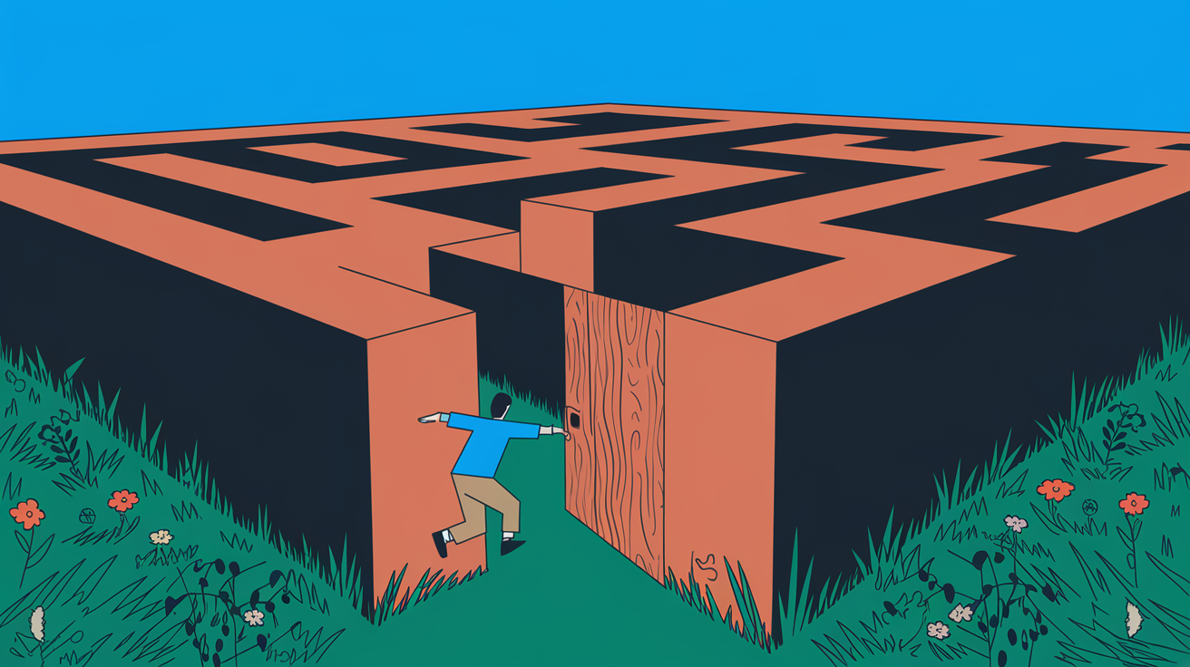
As a UX designer, I’ve seen how user flow mistakes can mess up the user experience and lower your product’s value. Some errors are inevitable, but knowing what to look for can help you fix many common user flow mistakes, user experience pitfalls, and design flaws. This article will cover 14 big usability issues, interface friction points, user journey obstacles, interaction pain points, UI workflow errors, navigation roadblocks, and user-centered design lapses. I’ll share strategies to avoid them and create amazing product experiences.
But first, are you sure your user flow design is top-notch? Or are there hidden problems that could be making things harder for your users? Let’s explore and find out together.
Understanding User Flow Design
User flow design maps out how users complete tasks or reach goals in digital products. It’s key to making user experiences smooth and enjoyable. By understanding what users do, finding their problems, and making paths clear, designers help users move through the interface easily.
This process ensures that users have a great time using the product. It uses diagrams to show the user’s path and spot where things get tough. These diagrams help improve the interface, share ideas with others, and guide the design work.
Creating effective user flows involves understanding user needs, goals, and pain points. By conducting research, testing, and refining designs, UX designers help users seamlessly navigate products and achieve their objectives.
Overlooking User Research
Many designers ignore user research. They design products without really knowing their audience, leading to solutions that don’t solve real user problems. To avoid this, it’s key to use methods like surveys, interviews, usability testing, and tracking user behavior.
These research methods help you create detailed user personas and empathy maps. They keep the user focused during design. Knowing what your audience needs and struggles with is crucial for making user flows that connect. If you skip this step, your solutions might not hit the mark, leaving users unhappy.
Don’t let guesses shape your design choices. Put user research first to get insights that guide your design. This early effort will lead to user experiences that please and engage your audience.
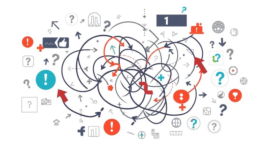
4 Common User Flow Mistakes
Creating a smooth user flow is key to great experiences. But, it’s easy to make mistakes. One big error is focusing on search engines over people. With over 60% of internet use on mobiles, making your site mobile-friendly is a must.
Not testing early versions of your product can cause problems. Complicated sign-up forms and bad onboarding are also issues. Too much clutter can overwhelm users and cause errors.
Ignoring UX writing and visual order can make finding things difficult. Fixing these mistakes can improve your interfaces. It’s important to check how well your design works to improve the user experience. Below are some common mistakes to watch out for:
1. Convoluted Sign-Up Process
A convoluted sign-up process can really hurt your conversion rates. Long, complicated forms turn users off and lead to high drop-off rates. To fix this, focus on making the sign-up simple by asking only for the needed info.
Reducing the steps in sign-up makes it easier and boosts conversion rates. Use clear labels for fields and consider adding more info later with progressive profiling. This makes the sign-up process clean and easy for users.
Portent found that every extra second in load time can drop conversion rates by 4.42% in the first five seconds. Studies also show a big drop in users moving on to the next steps, showing the need for a smoother sign-up. By making sign-up easier, you can improve the user experience and increase conversion rates.
2. Poor User Onboarding
In the digital world, first impressions matter a lot. User onboarding is key in the customer journey but often ignored. Many designers think their products are easy to use without making it clear, causing confusion and low adoption.
To make onboarding smooth, map out the customer journey and study user behavior. Use walkthroughs, tooltips, and checklists to guide users. This helps new users see your product’s value and stay engaged.
Research shows that 89% of US consumers want online self-service options. Personalized experiences boost customer regard. Early “Aha! moments” increase engagement, but missing interactive parts can hurt onboarding.
Clear goals and checklists help users begin. However, confusing user paths lead to dissatisfaction. Tools like Google Analytics help track and improve onboarding success.
Focus on user onboarding for a great first impression and more product use. It’s key for keeping users engaged and retained, so don’t skip it in creating a top-notch user experience.

3. Cluttered User Interface
Creating visually stunning user interfaces can lead to adding too many features and elements. This can cause users to feel overwhelmed and frustrated. To avoid this, focus on the most important parts and use white space well. This keeps the layout clean and organized.
Using the principle of progressive disclosure is a good strategy. It means showing features and content as the user needs them, not all at once. This way, your interface stays clean and focused on what the user wants, making it easier to use.
Also, focus on the visual order and the arrangement of information. Put the most important things first and use visual hints to guide the user. This makes the interface smooth and easy to use, reducing the mental effort needed.
The main aim of designing user interfaces is to make a great and efficient experience for users. By balancing functionality with simplicity, you can make an interface that looks good and helps users easily reach their goals.
4. Neglecting UX Writing and Visual Hierarchy
UX writing is key to guiding users and making their experience positive. If the writing is unclear, it can confuse users and make things harder to use. To fix this, I use simple language that helps and motivates users. I also make sure the most important parts of the interface are easy to see and find.
By focusing on UX writing and how things look, I make it easier for users to understand and enjoy the content. Research shows that most people prefer clear text and easy-to-read fonts. They also expect certain things to work when they click on them. If things are not clear, over 70% of users get lost on websites, showing how important clear design is.
Good UX writing and design together make for a smooth, user-friendly experience. By writing clearly and making content easy on the eyes, I help users feel empowered. This leads to happier users and more engagement with what I’m offering.
Master User Flow Design: Elevate UX and Engage Users Seamlessly With Mood Joy
Avoiding common user flow design mistakes is essential for creating seamless and enjoyable experiences for users. By prioritizing user research, simplifying processes like sign-ups, improving onboarding, decluttering interfaces, and focusing on clear UX writing and visual hierarchy, designers can greatly enhance the usability of their products. These strategies help reduce user frustration, increase engagement, and ultimately lead to more successful digital products that resonate with users.
Don’t let common user flow mistakes stand in the way of your design’s success. By addressing these challenges head-on, you can create seamless experiences that truly engage users. For more expert tips, design strategies, and in-depth UX insights, head over to Mood Joy. Whether you’re a seasoned UX designer or just starting, there’s always something new to learn. Keep exploring and refining your skills with our extensive range of articles.


