
Dark mode UI has long become more than just a design style. It is now an additional option for platforms, websites, or applications, improving the user experience and increasing accessibility.
However, creating a dark theme is not as easy as it might seem. It requires a painstaking approach and consideration of many details, making a well-thought-out plan the key to success.
Below, we will cover the primary pros and cons of night styling and explore the most effective ways to apply it. Follow these guidelines to figure out potential risks and steer clear of them.

Benefits of Dark Mode
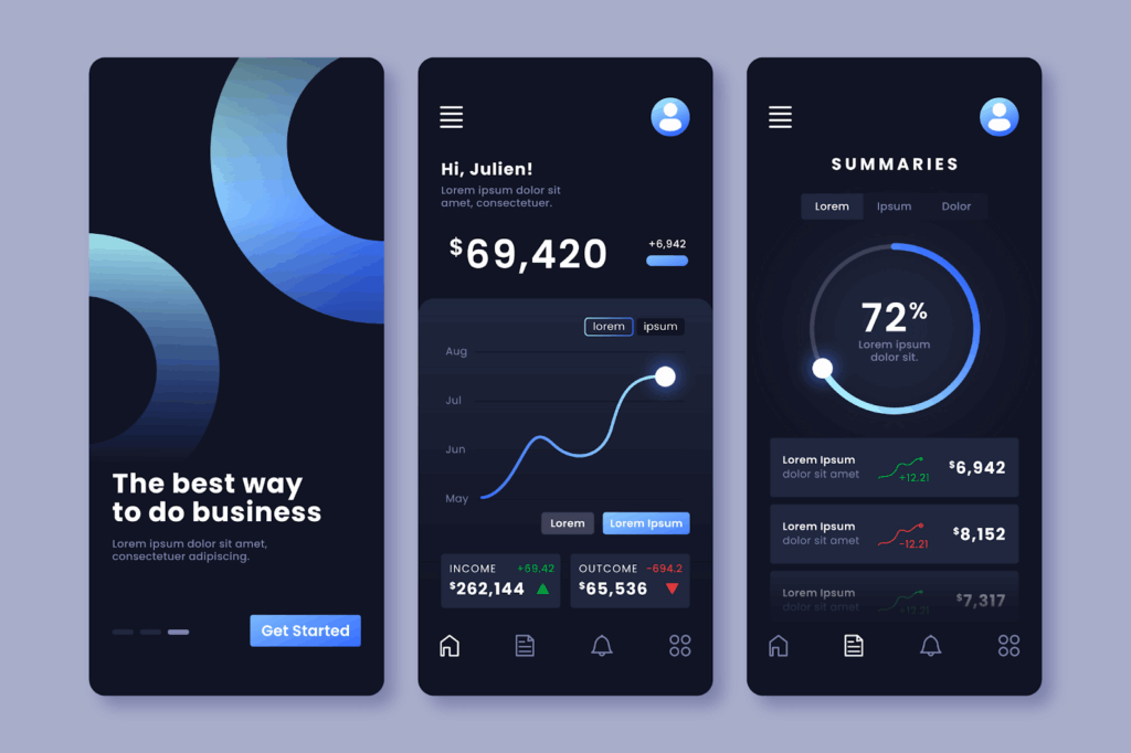
A light concept is equivalent to a piece of paper with black text against a light background. Instead, its dark analogue is a black and gray interface combination with light lettering for the content. It improves viewing at night or in low-light settings.
Dull tones decrease screen glare since they reflect less light, which enhances eye comfort and extends battery life. In addition, using dark mode web design can also be considerate in shared or dimly lit spaces, such as during night flights or on public transport.
Let’s summarize its main advantages.
Reducing Eye Strain
Prolonged exposure to bright light emitted by screens often leads to CVS (Computer Vision Syndrome). A dark theme emits less light, which lowers visual strain and optimizes comfort.
Improved Battery Life
Most modern devices have OLED screens. They have a large number of pixels, each of which produces its own illumination. Therefore, using the dark theme UI minimizes the number of glowing pixels. Consequently, the storage device operates longer and uses a lower power.
Enhancing Accessibility
The dark settings can be helpful for individuals with vision issues. They cut eye strain and enhance screen readability.
Aesthetic Preferences
A lot of people regard subdued colors as appealing and elegant. That is why some users prefer a theme to achieve a unified, succinct design.
Potential Problems With Dark Mode
Despite its many advantages, dark mode isn’t a universally applicable solution. It may not be appropriate in a number of cases. Here are some common challenges to consider.
Branding Issues
Some brand logos and color palettes might look less catchy on a dark background. As a result, they may lose their recognizability and customer attention. Therefore, if designers can’t adapt branding to a different color scheme, this may be a reason to abandon the theme.
Limited Compatibility
Not all platforms and operating systems support dark mode design. So if customers use your website or app on one of these, they may encounter compatibility issues. These may include incorrect interfaces or text block displays. The solution is to provide both light and dark theme options.
Accessibility and Readability Issues
For many users, dim illumination is a helpful alternative. However, people who have color blindness or astigmatism may find it problematic. They can have trouble comprehending blurry text.

Best Practices for Dark Mode
The approaches and tools used to create a light and dark theme are significantly different. To design a readable and visually appealing layout, designers must make an effort and work through all the interface elements. Below, we have collected several best practices for dark mode design worth your attention.
Don’t Just Invert Colors
Simply inverting the colors from light to dark will not give the desired look. To create an aesthetically pleasing theme, you need to develop a separate design and color palette.
If you reverse the colors without further modification, you will most certainly get a very dark background with harsh contrasts and poor readability. It will degrade the perception and affect the brand view.
Avoid Using Pure Black and White
Using pure black #000000 and pure white #FFFFFF colors creates excessive contrast. It may lead to eye strain and result in a negative customer experience.
Instead, opt for muted colors like #1F1F1F, #121212, and #Е0Е0Е0. If you are planning to transform a bright multicolored scheme into a dark theme, you may also use a dimmer palette for those colors. Remember, black or white is not mandatory.
Reduce Saturation
Bright details that you use for a light theme look even brighter in a dark version. Therefore, they also need adjustment. Your task is to soften their tones so that they match the overall theme style and do not stand out.
Avoid Shadows
Shadows are more common in light mode designs. They give an image depth and an illusion of three dimensions. However, in dark mode, shadows are less noticeable.
Additionally, they can occur in unpleasant dark areas that feel muddy or heavy. To obtain the required look of a dark theme, you, as a designer, must use some different strategies. These can be gradients, delicate sparkles, or soft highlights that establish visual hierarchy and depth.
Make Visible Focus Indicators
Focus indicators highlight separate design details and help people understand which specific elements they are interacting with. They contribute to seamless navigation of the platform, improving accessibility and usability. They can appear as a subtle outline around the main buttons or lighter fills. Their basic purpose is to highlight the content you want users to focus on.
Use Appropriate Images
Designing for dark mode involves more than just choosing colors. It also uses different images. You should prepare them according to the style and configure your theme to load them automatically when the user switches modes.
Test Your Design In Different Settings
While your newly designed theme may look great on your computer, it may have another view on other devices. Therefore, you should test it on various screens, as well as under different lighting conditions. This is to ensure that it is not only aesthetically pleasing but also accessible and easy to use.
Final Thoughts
Dark mode became mainstream in 2019. Since then, it has evolved from a simple aesthetic trend into an essential part of user experience. To make sure your dark design is right, go through this checklist:
- You can easily switch between the modes
- You can open your website even at night and browse the interface comfortably for your eyes
- You can see all the buttons clearly, and their color doesn’t irritate you
- Colors and visual effects complement each other to create a harmonious look
- You feel the voice of the brand just like in a light theme
If you’ve ticked every box, it means you’ve done a good job. Use our instructions on how to design dark mode to achieve the best result. Keep in mind that design quality is essential when engaging with a potential consumer.
FAQ
How is a dark theme different from a light theme?
In a light setting, the text is either dark or black with a white or light background. In contrast, a dark theme employs bright colors for the text and dark colors for the background.
What are the benefits of a dark theme?
It increases battery life, lessens eye strain, and makes material accessible to those with certain visual impairments. It also has a sleek, sophisticated appearance.
Why does developing a dark theme require attention and a special approach?
You must use additional tools to achieve a nice look and repeat visual effects comparable to a light theme. For example, you may replace shades with highlights or draw an extra outline around focus indications.


