Have you ever opened an app or website and felt instantly at ease, navigating it effortlessly as if someone designed it just for you? That kind of seamless experience is no accident — it’s the result of well-applied user interface (UI) design standards.
These principles are the foundation of intuitive, visually appealing, and user-friendly digital experiences. From ensuring buttons look clickable to maintaining consistency in typography and layout, UI standards make technology accessible and engaging for everyone.
In today’s fast-paced digital world, where first impressions happen in seconds, mastering these standards is a non-negotiable skill for designers. Understanding these essential guidelines will help you create products that captivate users and stand the test of time.
In this guide, we’ll explore the must-know UI design standards that can take your skills — and your designs to the next level. Let’s dive in!
Understanding User Interface Design Standards
User interface design standards guide how we use technology, from apps to websites. Designers follow these standards to make sure everything works well together.
Visual design is important in these standards. It makes sure the layout looks good and works well. Information architecture organizes content in a way that’s easy to follow. This makes it simple for users to find what they need.
Interaction design is at the core of these standards. It ensures that users have a good experience with digital products. By following these principles, designers improve how we use digital tools.
Adobe Photoshop is a great example of these standards in action. Its design follows important rules like giving feedback and being easy to use. This has made Photoshop a favorite for both pros and beginners, showing the value of good design.

Key Principles of Effective User Interface Design
Creating effective user interfaces relies on a few core principles that prioritize both usability and user experience. These principles focus on the design’s appearance, its organization, and how users interact with it.
When combined, these elements form the backbone of a seamless and enjoyable digital experience. They ensure that users can easily navigate, understand, and engage with products across various platforms.
Below, we explore these key principles and how they come together to create functional, engaging, and user-friendly interfaces.
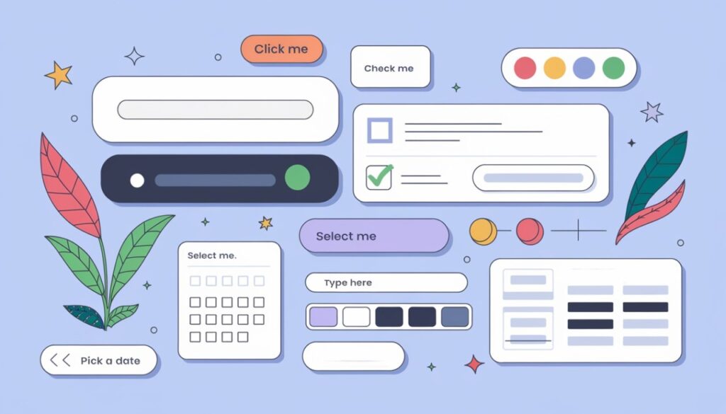
1. Visual Design Standards
Visual design standards, including color, typography, and iconography, are essential for effective UI guidelines. They ensure that user interfaces are visually appealing and easy to use.
Color theory plays a key role in creating harmony and conveying information effectively. For instance, Adobe Photoshop uses color-coded layers in its Layers palette to simplify navigation.
Typography ensures that the text is readable and the content is well-organized. The right fonts guide users smoothly through information.
Iconography is equally vital. Clear, recognizable icons aid navigation and comprehension, as seen in Adobe Photoshop’s toolbar. The rule of scale is also impactful, like in Medium’s iPhone app, where large icons draw attention.
Good visual design goes beyond aesthetics, enhancing usability and creating a seamless user experience. By adhering to these standards, designers craft interfaces that are both functional and visually engaging.
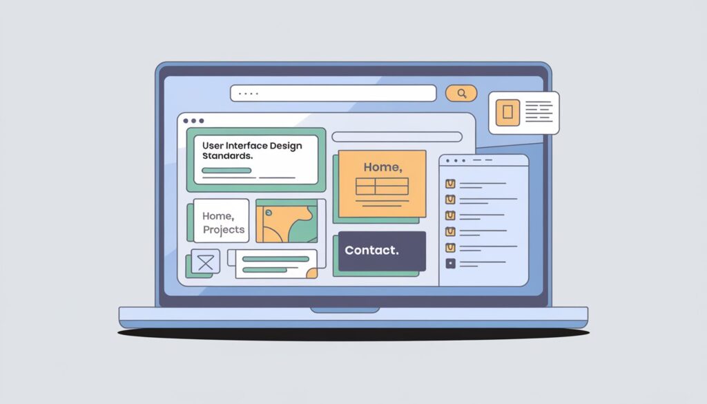
2. Layout and Structure Guidelines
Creating organized interfaces is crucial for effective information architecture. Grid systems provide a solid base for aligning elements, making it easier for users to navigate content and boosting usability.
Design patterns are vital in layout structure. Responsive layouts adjust to different screen sizes, offering a seamless experience. Fixed layouts, however, keep a consistent look, which suits some content types well.
Whitespace is a key tool in UI design. It improves readability and focuses user attention on key elements. By using whitespace wisely, designers can create a visual hierarchy that enhances the user experience. This aligns with usability principles, making interfaces more intuitive and fun to use.
Adobe Photoshop is a great example of these guidelines. Its interface uses terms like RGB and CMYK, matching real-world concepts. The program also uses visual cues and previews, helping users recognize options without needing to remember details. This approach makes learning easier and boosts efficiency, showing the importance of thoughtful layout and structure in UI design.

3. Interaction Design Standards
Interaction design is all about how users interact with interfaces. It sets rules for button design, gesture navigation, and visual feedback. Good interaction design follows usability principles and patterns that feel like real-world actions. For instance, pinch-to-zoom is like how we handle physical objects.
The placement of buttons is key in interaction design. The right spot makes things easier for users, cutting down on mental effort. Nielsen and Molich’s guidelines highlight the need for clear and consistent UI elements. Adobe Photoshop shows this with its easy-to-spot tool icons and customizable spaces.
Animations and transitions help guide users through tasks with visual cues. They make the experience better without getting in the way. Remember, our brains can only hold about five things at a time. This means the interaction design should be clear and easy to recognize, not just remember.
User Experience (UX) and User Interface (UI) Relationship
User experience and user interface design are key to making digital products work well. UX makes sure the product is easy and fun to use. UI focuses on how it looks and feels. Together, they ensure users have a good time using the product.
UX design starts with understanding what users need and want. This info helps guide UI decisions. For instance, slow websites scare off 51% of visitors, showing the need for fast performance.
UI designers aim to make the interface look good and easy to use. They work on things like buttons and colors. A good-looking website can make 46% of people trust a company more. By following usability principles and design patterns, UI designers can make interfaces that users love.

Accessibility Standards for UI Design
Accessibility in UI design means making interfaces work for everyone. The Web Content Accessibility Guidelines (WCAG) set the standard for digital accessibility. These guidelines focus on four key principles: perceivable, operable, understandable, and robust.
WCAG 2.2, introduced in October 2023, offers higher standards. It guides designers in creating interfaces that work with assistive technologies like screen readers. The guidelines also stress the importance of keyboard navigation and touch-only interaction for mobile users.
Practical steps for accessible UI design include using proper contrast ratios for text. It’s also important to provide visible keyboard focus and ensure consistent navigation. Labels for form elements and clear error feedback are crucial.
Designers should also consider different viewport sizes. This creates responsive layouts that work on various devices.
Accessibility testing is vital in UI design. A mix of automated and manual testing helps identify potential barriers. Designers can use tools like VoiceOver or JAWS to test with screen readers.
Regular accessibility audits and community feedback help improve designs over time. By embracing these standards, designers create interfaces that truly work for all users.

Mobile User Interface Design Standards
Mobile UI design standards face the challenge of smaller screens and touch interactions. UI guidelines for mobile apps aim to make interfaces easy and friendly. Design patterns help keep interfaces consistent across different devices and sizes.
A study showed that 32% of customers might switch brands after a bad experience. This shows how crucial good mobile UI design is.
Usability principles for mobile interfaces stress simplicity, predictability, and user control. Touch targets should be big enough for finger taps, and gestures should be easy to understand. Navigation should make it simple to find important features.
Understanding user flow is key to smooth mobile experiences.
Inclusivity is also vital in mobile UI design. Designers must consider users with different physical, sensory, and cognitive needs. Color-blind-friendly themes and adjustable text sizes are examples of inclusive design.
By following these standards, developers can make apps that work well for more people. This leads to a better experience for everyone, no matter the device.
Usability Testing Methodologies
Usability testing helps designers check and improve their interfaces. Let’s look at some main ways to test usability:
- A/B testing compares two designs to see which one works best. It lets designers choose based on what users like.
- User surveys give feedback on experiences, showing what needs work.
- Quantitative testing provides numbers, such as task completion speed and error rates, which help identify specific problems.
- Qualitative testing offers deeper insights into why users act a certain way.
- Remote usability testing is an affordable method where users complete tasks independently, often via video calls, enabling feedback from diverse locations.
Using these methods together helps designers create user-friendly interfaces. Regular testing and updates are important to keep the interface user-friendly.
Tools and Software for UI Designers
UI designers use many tools to create great interfaces. Adobe XD, Sketch, and Figma are top choices. These tools help designers follow best practices for interface design.
Figma is famous for its teamwork features and icon-making tool. It’s free for one person, but teams start at $12 per month. Sketch is easy to use but only works on Macs, and it costs $12 a month. Adobe XD, part of Creative Cloud, has a free plan and costs $52.99 monthly for full access.
InVision and Axure are key for making prototypes. InVision offers interactive prototypes and teamwork tools for $9.95 a month. Axure RP is great for quick prototyping, costing $25 a month. These tools help designers test and refine their work.
Zeplin makes teamwork easier in design. It costs $8 a month for teams and helps designers and developers work together smoothly. With these tools, UI designers can create consistent designs and deliver easy-to-use interfaces.
Future Trends in User Interface Design
The world of user interface design is changing fast. New technologies and user needs are leading to new design patterns. Voice user interfaces are becoming more common, making designers rethink how we interact.
Artificial intelligence is changing how we design for users. AI makes interfaces more personal by adapting to each user. It also predicts what users might need next, changing our design approach.
Sustainability is a big focus in future design. Designers now think about the environmental impact of digital products. They aim to make interfaces that are good for the planet and great for users.
Looking ahead, augmented and virtual reality will change how we interact with digital products. These technologies will bring new challenges and chances for designers. The future of UI design looks bright, with more personalized and sustainable digital experiences.
Designing for Impact: Mastering UI Standards for Timeless Interfaces
By adhering to UI design standards, designers create products that are accessible, intuitive, and visually appealing. Inclusive design practices boost engagement and satisfaction, while staying informed on trends, which ensures relevance in an ever-evolving digital landscape. Through continuous learning and innovation, UI designers can craft interfaces that exceed user expectations and stand the test of time.
Ready to take your designs to the next level? Mood Joy provides expert insights and practical tips to support your journey, whether you’re mastering accessibility guidelines or perfecting your layouts.


