Visual hierarchy UX is where beauty meets function. It’s a key design element that makes websites easy to use and fun to explore. By using visual hierarchy, designers guide users smoothly from start to finish.
Visual hierarchy is like a guide for users on websites. It helps them find their way through content easily. Look at Williams-Sonoma.com, for example. Their site is clean and clear, making it easy to read and use.
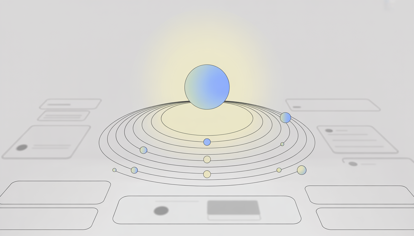
By carefully choosing elements like size, color, and contrast, designers improve user experience. This builds trust and strengthens the connection between the user and the brand.
Let’s dive deeper into the world of visual hierarchy. We’ll see how it shapes user experience design and follows the best practices for digital success.
Understanding Visual Hierarchy in UX Design
The importance of visual hierarchy in user experience (UX) design is huge. It helps guide how users interact and makes digital platforms easy to use. By organizing content well, it boosts user engagement and helps them process info faster.
In hierarchy in web design, elements are placed to grab attention based on their importance. This way, content is prioritized and users move smoothly from one thing to another. Designers use size, color, and placement to show what’s most important, making it simple for users to find what they need.
Knowing how users look at things is key to a good hierarchy. Designers use what we know about how people look at things to design better. For example, in cultures that read from left to right, the top left gets the most attention. This helps create a clear path for users to follow.
Getting good at importance of visual hierarchy in UX design means making a site that’s easy for users to understand. It’s about making complex things simple and making sure important stuff stands out. This is a vital skill for web designers to have.
Principles of Effective Visual Hierarchy
The principles of visual hierarchy are key in web and UX design. They help users navigate content easily. Using size and scale is a big part of this. For example, bigger elements grab attention first, making important info clear.
Websites like Jersey Dairy Milk use this to draw the eye to key content right away.
Color and contrast also play a big role. Bright, bold colors grab attention and help point out important stuff. Adding different typography styles and weights helps guide the viewer’s eye.
Websites like Hipcamp.com use these visual design techniques well. They use big, bold text for important info and contrasting colors for less important details. This makes for a smooth user experience.
Knowing the common mistakes in user flow design helps designers use these principles better. By avoiding pitfalls, designers can improve how users interact with the site.
The Role of Whitespace in Design
Whitespace is key to making designs better for usability and accessibility. It’s not just empty space. It’s a tool that makes layouts clear and grabs attention. It’s a top UX best practice that makes reading and understanding easier.
Using whitespace well is not just about looks. It’s about placing spaces to highlight important parts. For instance, more space around buttons makes them easier to tap on small screens. This boosts usability and accessibility.
Spotify shows how to use whitespace well. They space out elements to keep controls and options clear. This clear layout reduces mistakes and makes navigation better, following the best UX best practices. When designs are easy to use and understand, users are happier and interact more.
So, adding enough whitespace in design is not just about looks. It also makes designs work better for usability and accessibility. It’s a must for any project aiming for top-notch user experience.
Grouping Elements for Clarity
In the world of UI/UX guidelines, grouping elements is key. It makes visual hierarchy UX clearer. The aim is for users to quickly see which elements go together and which don’t.
This makes navigation smooth. By placing related items together, designers make it easy for users to understand the connections. It feels natural and logical to them.
Many successful websites and apps use this principle. For instance, Shopify’s checkout page is a great example. It keeps form fields close together with little space in between.
This makes it easy for users to see everything as part of a single process. It helps in making purchases faster and reduces mistakes.
Following these UI/UX guidelines improves user experience. It helps avoid clutter by making it clear what’s important. This leads to happier users and more engagement with the platform.
Utilizing Color to Impact Perception
Color in user interface design makes things look better and affects how users feel and decide. Knowing how emotional responses to colors work can change how people see and use a product. It can make users more engaged.
Choosing the right color schemes and branding is key. Blue means trust and stability, so it’s common in tech and finance. Green is for health and calm, great for wellness brands. Using colors wisely helps create a strong brand that people connect with.
Good color use is not just picking the right colors. It’s also about how they work together in the design. For instance, the Museum of Modern Art (MoMA) uses simple colors to show off sophistication and creativity. These are important for their brand.
In short, using color schemes and branding well in design does more than just look good. It makes users feel certain ways and helps them remember the brand. This leads to a better user experience and more engagement.
Balancing Text and Images in Layouts
Finding the right mix of text and images is key in web design. It grabs the user’s attention and makes your message clear. When text and images work together well, they make the content easier to follow.
Choosing the right images is crucial. They should match the text without taking over. For instance, a blog post might use a diagram to explain complex ideas. This keeps the reader interested without losing the main point.
It’s important to pick the right typeface, font size, and color for the text. These should look good and be easy to read. The way text and images are arranged should also follow a clear order. This helps the viewer’s eye move smoothly through the content.
Combining text and images is not just about fitting them together. It’s a chance to use design to make your message clearer. The goal is to create a user-friendly interface that makes information easier to understand and remember.
Implementing Visual Hierarchy in Navigation
Good navigation is key to making websites and apps better. By following UI/UX guidelines, designers can make a clear path for users. This makes it easy to find important stuff.
Putting key links in the top-right corner is a smart move. It helps users find things like account access and search easily.
Visual hierarchy also makes navigation smoother. It puts important stuff first, making it easy to find. This makes the site more usable.
Designers who follow UI/UX guidelines create better navigation. They make sites that are easy to use and fun. This makes digital spaces more welcoming for everyone.
Responsive Design and Visual Hierarchy
In digital design, combining responsive design with a clear visual hierarchy is key. It ensures a smooth user experience on all devices. Designers focus on making things look good and work well on different screens.
Responsive design is crucial for mobile content. It makes interfaces simpler, touch targets bigger, and key content more visible. This keeps users engaged and focused, even on small screens.
Creating a responsive visual hierarchy needs careful planning and understanding of how devices work. It’s about making sure everything looks and works great on any screen. Following mobile UX best practices helps keep the visual hierarchy effective. It makes sure users can navigate easily and have a consistent experience everywhere.
Testing and Iterating on Visual Hierarchy
Understanding and refining a website or app’s visual hierarchy is key to better user experience. User testing strategies help designers and developers see how users interact with their designs. Methods like A/B testing, user interviews, and tools like heat maps give valuable insights into what users like and do.
Using UX best practices, designs should change based on user feedback. This means testing different parts of the visual hierarchy to see what works best. Tools like Hotjar provide detailed analysis, showing how well different parts grab attention and lead to action.
Designers also look at metrics like click-through rates and conversion rates to measure the impact of changes. Regular updates, based on UX best practices, keep the visual hierarchy effective and in line with user expectations. This leads to a better user experience.
In the end, using strong user testing strategies and making changes based on data and feedback greatly improves UX design. This ongoing effort not only makes the product easier to use but also makes sure it meets users’ changing needs and preferences.
Common Mistakes in Visual Hierarchy
When designing digital interfaces, some common mistakes can really hurt usability and accessibility. One big error is giving users too much information at once. This makes the interface cluttered and hard to focus on anything.
UI/UX guidelines tell us to make a clear hierarchy of elements. This means we should have primary, secondary, and tertiary elements. Each should be clear in its importance to help users understand and interact better.
Another big issue is ignoring accessibility needs. Designs that don’t consider color blindness or other visual issues can miss out on many users. It’s key to use enough color contrast, scalable fonts, and clear navigation as UI/UX guidelines suggest.
Designers should aim to make their work both beautiful and functional for everyone. This means creating interfaces that are engaging, easy to use, and accessible to all. By focusing on a clear and inclusive visual hierarchy, designers can avoid common mistakes and make better digital spaces for everyone.
Case Studies: Successful Applications of Visual Hierarchy
Looking at real-world examples of visual hierarchy UX shows how design can change things. TheNounProject.com is a great example. It uses contrast to guide users and make navigation easy. This is a top way to design websites, making sure users find what they need quickly.
Shopify is another great example, focusing on user forms. It uses proportional grouping to make things easier for users. This shows that good design is not just about looks. It also makes things work better, helping users get what they need fast and easy.
These examples prove that visual hierarchy in web design is more than just looks. It makes websites easy to use, which leads to happier users. Websites that follow these best practices do better in usability and get more users to take action.
The Future of Visual Hierarchy in UX
The world of UX design is always changing. New trends in visual hierarchy keep coming as technology gets better. We’re heading towards a future where visual hierarchy makes things simpler and better for users. It will also match how we naturally interact with digital stuff.
Minimalism is already leading the way to cleaner, more focused designs. It makes sure the most important parts grab our attention right away. This makes our digital experiences better and more enjoyable.
Augmented reality is set to take visual hierarchy to new levels. It changes how we see and use digital interfaces. With AR, we can add virtual stuff to the real world, making experiences more immersive.
This shows how crucial visual hierarchy is for making interfaces that are easy to use and fun. As technology keeps evolving, UX design will too. It will adapt to new devices and situations, keeping user needs at the center.
Looking forward, visual hierarchy will keep being key for great user experiences. The UX design world needs to stay alert and open to new tech and ways of designing. By understanding what users want, designers can keep making things better and more relevant.


