Every form on your product is a conversation. You ask a question, the user answers it, and the interaction moves forward. But most forms feel less like conversations and more like interrogations. Long field lists, confusing labels, and vague error messages push users away before they finish. Good form design removes friction at every step. This guide covers the principles, patterns, and decisions that help you design forms users actually complete.
Start With the Fewest Fields Possible
The number one rule of form design is to ask only for what you need. Every extra field reduces your completion rate. Research from Formstack found that reducing a form from 11 fields to 4 can increase conversions by up to 160%. Before you build, audit every field and ask whether you truly need that information at this moment.
Defer Optional Fields
Separate required fields from optional ones. Better yet, move optional fields to a later step in the user journey. A signup form needs an email and a password. It does not need a phone number, a birthday, and a company name on the same screen. Collect optional data after the user has committed to the product and trusts you enough to share more.
Use Progressive Disclosure
Show fields only when they become relevant. A shipping form does not need to show a state tax field until the user selects a country that requires it. Progressive disclosure keeps the visual length short and prevents users from feeling overwhelmed before they start.
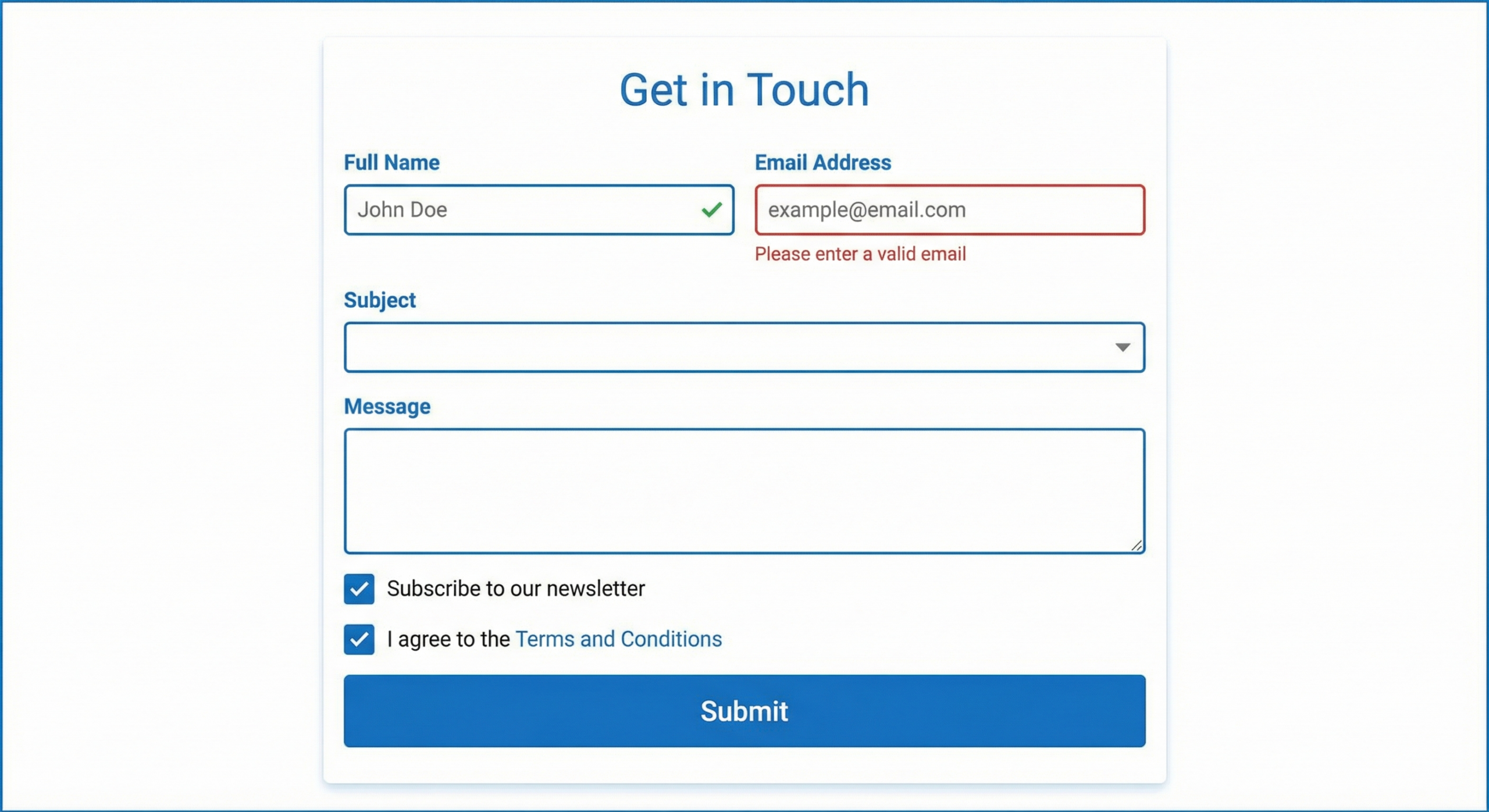
Write Labels and Placeholder Text Correctly
Labels tell users what information each field requires. Poor label placement and vague wording are among the most common form design mistakes. Small changes to label copy and position can dramatically improve completion rates.
Always Use Persistent Labels
Placeholder text inside the input field is not a replacement for a label. Once a user starts typing, the placeholder disappears. Users then have to erase their answer to remember what the field asked for. Place labels above or beside the input field where they remain visible at all times.
Write Labels That Match User Language
Use plain language that matches how your users think, not internal company jargon. “Mobile number” is clearer than “contact telephony.” “Card number” is clearer than “PAN.” Run a quick usability check if you are unsure whether your labels map to what users expect.
Use Inline Hints for Formatting Requirements
When a field has specific formatting requirements, show an example below the label before the user makes a mistake. For a date field, show “MM/DD/YYYY” as hint text. For a phone number, show “(555) 555-5555.” Proactive hints prevent errors and reduce the cognitive load of guessing what you want.
Design Input Fields for the Data Type
One of the most overlooked form design decisions is matching the input control to the type of data being collected. Using the wrong input type creates unnecessary friction and increases error rates.
Choose the Right Input Control
Use radio buttons when the user must select exactly one option from a short list (fewer than five items). Use checkboxes for multi-select options. Use a dropdown only when the list is long enough that showing all options at once would clutter the form. For binary choices, consider a toggle switch instead of a dropdown with “yes” and “no.”
Set the Right Keyboard on Mobile
Mobile browsers can trigger different keyboard types based on the HTML input type attribute. Use type=”email” to show the email keyboard. Use type=”tel” for phone numbers. Use type=”number” for numeric inputs. These small details remove unnecessary taps and reduce the chance of formatting errors on smaller screens.
Size Fields to Match Expected Input Length
A ZIP code field should be shorter than a street address field. Visual length signals to the user how much text is expected. When a short field looks wide enough for a paragraph, users second-guess whether they understood the question. Match field width to the expected answer length.
Handle Errors in a Way That Helps Users Fix Them
Error messages are where most forms fail their users. A red border and “invalid input” tells the user something went wrong but not how to fix it. Helpful error handling keeps users in the flow instead of driving them away.
Validate Inline, Not on Submit
Inline validation checks each field as the user finishes it, rather than waiting until they click submit. When a user tabs out of an email field after entering a malformed address, show the error immediately. This catches mistakes early and prevents the disorienting experience of having a form reject multiple fields at once on submission.
Write Error Messages That Explain the Fix
Every error message should answer two questions: what went wrong, and what should the user do next. “Please enter a valid email address” is better than “Invalid email.” “Password must be at least 8 characters” is better than “Password too short.” Be specific. Be direct. Avoid blame.
Preserve User Input on Error
Never clear a form on submit if validation fails. Users should see their answers still filled in, with only the problem fields highlighted. Clearing the form forces users to re-enter everything they already typed, which is a fast path to abandonment.
Form Layout and Visual Design Decisions That Matter
Layout choices affect how quickly users scan a form, understand its structure, and move through it. Good visual design is not decoration here. It directly affects task completion.
Single-Column Layouts Outperform Multi-Column
Research from the Nielsen Norman Group shows that single-column form layouts are easier to complete than multi-column layouts. Users scan forms top to bottom. Multi-column layouts interrupt that natural scan path and force users to zigzag across the page. Use two columns only for logically paired fields like first name and last name.
Group Related Fields With Visual Separation
Use spacing, dividers, or section headers to group related fields together. Billing information, shipping information, and payment details should each live in their own visual block. Clear grouping reduces cognitive load and helps users understand where they are in the form.
Place Primary Actions Below the Last Field
The submit button should sit directly below the final field in the natural reading flow. Do not center it in a way that separates it visually from the form content. Label the button with a specific action like “Create Account” or “Complete Purchase” rather than a generic “Submit.”
Form Design Patterns Compared
| Pattern | Best Use Case | Avoid When |
|---|---|---|
| Single-page form | Short forms (fewer than 6 fields) | Collecting complex multi-step data |
| Multi-step wizard | Long or complex forms (checkout, onboarding) | Users need to review all fields at once |
| Inline validation | Forms with formatting requirements | Very short forms where submit validation is fine |
| Autofill-friendly fields | Repeat-use forms (login, checkout) | Sensitive fields where autofill poses security risk |
| Conditional fields | Forms with variable data needs by user type | Simple forms with no branching logic |
| Floating labels | Space-constrained mobile forms | Accessibility-sensitive products (can confuse screen readers) |
Frequently Asked Questions
How many fields should a form have?
Use as few fields as possible to complete the task. For most lead generation forms, three to five fields hit the sweet spot between data quality and completion rate. For checkout flows, group fields across steps so no single screen feels overwhelming. Remove any field you cannot justify with a clear business reason.
Should I use placeholders or labels?
Use both, but for different purposes. Labels should appear above or beside the field and always stay visible. Placeholders can show a formatting example inside the field but must never replace the label. When a placeholder is the only label, users lose context the moment they start typing.
When should I use a multi-step form?
Use a multi-step form when you have more than six to eight fields or when the data naturally groups into distinct phases (personal info, preferences, payment). Multi-step forms can improve completion rates by making long forms feel shorter. Always show a progress indicator so users know how many steps remain.
What is the best button label for a form submit?
Use a specific, action-oriented label that reflects what happens next. “Create Account,” “Get My Free Trial,” and “Place Order” all outperform “Submit” in usability tests. The label should confirm to the user exactly what they are agreeing to when they click.
How do I reduce form abandonment?
Remove unnecessary fields, use inline validation, write clear error messages, and make your privacy policy easy to find near sensitive fields. On long forms, save progress automatically so users can return without starting over. Showing a trust signal like a security badge near payment fields also lifts completion rates.
Is autofill good or bad for form design?
Autofill is good for most forms. It speeds up completion and reduces typing errors. Make sure your fields use standard HTML autocomplete attributes so browsers and password managers can fill them correctly. The exception is sensitive security fields like one-time passwords, where you should disable autofill intentionally.
How should I handle required vs optional fields?
Mark required fields clearly, either with an asterisk or with the word “required” in small text. Do not mark optional fields with an asterisk since users often read it as required. Ideally, remove optional fields from the initial form entirely and collect that data later when the user is more engaged.
Good Form Design Is Invisible
The best form a user ever fills out is one they barely notice. No confusion about what to type. No frustration over error messages. No second-guessing whether the submit button worked. Good form design removes every obstacle between the user’s intention and the completed action. Start with fewer fields, write labels in plain language, validate inline, and match every input control to the data type it collects. Small improvements compound fast. A two-percent lift in completion rate across thousands of form submissions adds up to real business impact.