
Ever looked at a website or logo and instantly “got it”? That’s no accident — it’s the power of Gestalt design principles at work. Rooted in psychology and developed by German theorists in the early 1900s, these principles explain how we perceive patterns. They also describe how we perceive groups and visual relationships.
Today, they’re essential tools for modern designers aiming to create clean, intuitive, and engaging experiences. Whether it’s aligning elements to guide the eye or using color and spacing to highlight key actions, Gestalt thinking helps. It allows users to navigate the design without even realizing it.
Want to know why proximity, similarity, and continuation can boost usability — and even increase user engagement by over 60%? Stick around. These principles might just change how you design everything.
Introduction to Gestalt Design Principles
The psychology of design is key to creating exceptional user experiences. In the early 20th century, Max Wertheimer introduced the Gestalt design principles — ideas later expanded by Wolfgang Köhler and Kurt Koffka. These principles reveal how people perceive visuals as unified wholes rather than disconnected parts, shaping how we naturally interpret what we see.
For designers, understanding these principles is essential. They help improve how users interact with everything from websites to mobile apps. The principle of similarity suggests that we perceive elements that look alike as part of the same group. This idea simplifies navigation and helps users find related content effortlessly.
Continuation encourages the eye to follow paths, lines, or curves, which makes design layouts feel smooth and intuitive. The closure principle allows users to mentally fill in missing parts of an image or interface, keeping designs clean yet complete. Proximity groups related elements by placing them close together. The figure/ground principle helps highlight what matters most on a screen.
These aren’t just academic concepts — they’re practical tools that enhance usability, clarity, and aesthetics. Many common mistakes in user flow design stem from ignoring these basic principles. This can lead to cluttered layouts, confusing navigation, or poor visual hierarchy.
By applying Gestalt principles thoughtfully, designers can create more effective, user-friendly experiences. These experiences are both functional and visually appealing, bridging the gap between psychology and creativity.

Visual Perception and Gestalt Principles
Visual perception is key in how we see and understand design. Gestalt design principles help our brains sort out what’s in the front and what’s in the back. They make it easier to spot important shapes by using contrast and comparison.
The figure/ground principle is a great example. Designers use it in the FedEx logo to hide the arrow in plain sight. This trick helps people remember the brand better.
The Kin Ecosystem’s website redesign is another example. It used the law of continuity to boost traffic by 120%. This law helps our brains follow continuous shapes, making the site easier to navigate.
The principle of similarity is also important. Designers use it in designs like Spotify and the Ukrainian Power project. Even though colors change, shapes and sizes that are similar help us see things as a whole. This makes it easier for users to find their way around.
Contrast in design is crucial because our brains process most visual info almost instantly. This means that designs need to be clear and organized to grab our attention and work well. For example, symmetrical designs like the Olympic logo can make users trust and believe in a brand more by about 20%.
In UX/UI design, the principle of proximity can make things clearer by up to 30%. When things are close together, we see them as connected. This helps information flow smoothly. The principle of common fate is also important. You often see it in animations where moving dots or lines indicate progress. This creates a clear story that guides users and improves their experience.
Using Gestalt design principles wisely helps designers create better, more user-friendly designs. It shows how important it is to think about how users see and interact with designs. This way, designs can be both beautiful and functional.
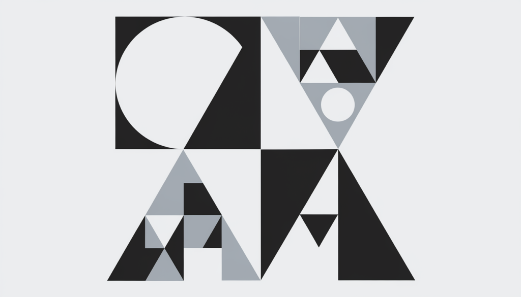
The Core Gestalt Principles
At the heart of Gestalt theory are several key principles that explain how we organize visual information:
- Proximity: Elements placed close together are perceived as related. This is especially useful in grouping buttons, links, or form fields for smoother navigation.
- Similarity: Items that share similar color, shape, size, or font appear to belong to the same group. This helps users identify categories or repeated actions easily.
- Continuity: Our eyes follow lines and curves naturally. Designers use this to guide the viewer’s gaze across a layout in a smooth, flowing way.
- Closure: The brain fills in missing parts to form a complete picture. Designers often use this in logos or minimal designs where full shapes aren’t necessary for recognition.
- Figure/Ground: This principle helps users distinguish the main subject (figure) from the background. Designers often use it to highlight CTAs or key content.
- Common Fate & Prägnanz; Movement and simplicity also influence perception. For example, when elements move together, we perceive them as part of the same group, and we process simpler shapes more easily.
Applying Gestalt Principles in Design
Using Gestalt principles in design makes things easier for users. It helps organize content in a way that’s easy to follow. This makes sure users see the most important parts first. It’s all about making things smooth and fun for users, thanks to the psychology of design.
Brands use these principles to look good and feel right. For example, making things look the same helps create a strong brand look. This makes people remember the brand better and feel loyal to it.
Proximity is another key principle. It means things close together look like they belong together. This helps group things in a way that’s easy to understand. The Law of Prägnanz makes things simple, making designs better to look at and use.
Continuity makes connected elements appear as if they belong together. This makes designs flow better. Using different fonts, colors, and sizes for headers helps organize content. This makes things more interesting and helps with search rankings.
The principle of closure helps users fill in missing parts to see complete pictures. This makes designs look more complete and connected. Over the years, designers have gotten better at using these principles. They make designs that are not only good-looking but also easy to use and understand.

Practical Examples of Gestalt Principles
Apple is famous for simple and easy-to-use designs. Their icons show the principle of similarity. Icons with similar shapes and colors form groups, using Gestalt similarity to support fast and intuitive visual perception.
Google also uses Gestalt principles to make their designs appealing and easy to use. They group related elements close together, making things clearer. This makes users happier and more efficient.
Both Apple and Google use the continuity principle to keep their designs consistent. This makes using their apps and websites smooth and enjoyable. It shows how important Gestalt principles are in design.
Designers use these principles to make interfaces both beautiful and easy to use. This proves that Gestalt principles are effective in real-world design, from Apple to Google.
Common Mistakes in Applying Gestalt Principles
A big problem in design is not using white space well. This leads to messy and hard-to-use interfaces. It makes it tough for users to find what they need. Using white space can boost user interest by about 30%.
Another big mistake is not using the proximity principle correctly. When things that shouldn’t be together are close, it tricks users. This principle says things close together look like a group. But using it wrong can mess up navigation by up to 50%.
Also, not using the Law of Similarity correctly can confuse users. This law says our eyes group similar things, helping us understand better. But using it wrong can cut down on user understanding by up to 40%. It shows how important it is to align and style things right.
Ignoring the importance of headers can also mess up content organization. Not doing this can make it hard for users to understand by about 75%. Designers should work on making things clear and organized.
Getting feedback and testing are key to avoiding these mistakes. Using user testing can make designs better by 70%. It ensures the design works well and meets user needs, making them happy.
Tools and Resources for Gestalt Design
Designers looking to explore Gestalt principles have many resources at their disposal. Tools like Adobe Photoshop and Sketch are key for applying these principles in projects. Online platforms and courses also provide valuable design education.
The human brain can process a lot of data quickly. This makes it important to use the right tools to present information. With most sensory data coming through our eyes, using Gestalt principles is crucial for good design.
Software like Adobe XD and Figma are also essential. They help organize visual elements using principles like proximity and similarity. This makes designs more cohesive and intuitive.
For more education, sites like Coursera and Udemy offer courses on Gestalt principles. These courses include practical projects to apply what you learn. Online communities and platforms allow designers to share ideas and get feedback.
Using Gestalt principles with the right tools can make designs more appealing and functional. This approach to design education prepares designers to create products that are both beautiful and user-friendly.
Future of Gestalt Principles in Design
Looking ahead, the evolution of visual communication will continue to use Gestalt principles. These principles are key, thanks to new technology and digital media. Chang et al. (2002) found that websites applying Gestalt principles appear more attractive and easier to use.
Responsive design is becoming more important, making visual hierarchy crucial across different screens. Adobe’s Sensei AI uses Gestalt principles like proximity and similarity to improve layouts. This ensures a design that is both cohesive and user-friendly.
In augmented reality (AR) interfaces, the principle of common region is vital. It helps users tell apart real-world elements from digital overlays (Dey et al., 2018). This shows how Gestalt principles are evolving for new design needs. For more on this, see this detailed discussion.
Practical examples show the power of Gestalt principles. For instance, grouping navigation elements improves user satisfaction. The Law of Similarity helps users see similar elements as a single unit. This can greatly affect how users interact with designs.
As design evolves, so will the use of Gestalt principles. Designers now use different font sizes, colors, and types to help users understand content. For a deeper look, researchers have documented the role of Gestalt principles in design over the past 20 years.
It’s important to understand these principles as they adapt to new formats and contexts. They shape how designers approach visual communication and user interaction. Using these principles effectively can greatly enhance the user experience, making them essential in modern design.
Wrap It Up Right: Design Smarter with Gestalt Principles
Understanding and applying Gestalt principles is a game-changer for designers. They allow you to craft designs that are not only beautiful but also highly functional and user-friendly.
From the way we group elements to how we follow lines and fill in shapes, Gestalt principles reflect real human behavior. Use them intentionally, whether designing a homepage, mobile app, or business card, and your work will stand out for all the right reasons.
A design that looks good is great. Design that feels right? That’s where Gestalt comes in.If you’re passionate about creating clean, intuitive, and human-centered interfaces, there’s plenty more to explore. Mood Joy is full of insights, tips, and practical advice on UX/UI best practices. Head over to the blog to keep learning and elevate your design game.


